Let’s be honest—nobody wakes up thinking, “Wow, I can’t wait to design a box today.” But if you’re a brand selling physical products, that humble cardboard box might just be your most underrated sales tool.
And guess what? You’re already winning by choosing paper packaging. According to an Ipsos survey:
71% of consumers say they prefer products packaged in paper or cardboard over plastic.
63% believe paper packaging makes a product feel more premium.
That means even before your customer opens the box, you’ve already made a good impression—without saying a word.
But here’s the catch: just slapping your product into a plain brown box? Not gonna cut it. In the age of TikTok hauls and Instagram unboxings, packaging isn’t just about protection anymore. It’s a performance.
Your product’s box is now part of the show—and you want a standing ovation.
What Businesses Can Do With Custom Cardboard Boxes?
Whether you’re running a DTC brand, scaling your ecommerce business, or managing wholesale orders by the truckload, your packaging should:
Match your brand vibe (yes, your box has a vibe)
Tell your story—visually and verbally
Make unboxing a moment customers want to share
Be practical, protective, and pretty (the triple threat)
Because in the end, you’re not just shipping products.
You’re shipping first impressions.
Let’s face it—packaging design can make or break the unboxing experience. Sure, you’ve got your logo, brand colors, and that one font you’re irrationally attached to. But what now?
Tip 1:Break the Box: Think Outside the Rectangle
Sure, rectangular boxes are the default—they stack nicely and don’t offend anyone. But sometimes, it pays to shake things up… literally.
Unconventional shapes (think triangles, hexagons, or even a prism) can help your product stand out instantly. One soap brand ditched the traditional cube and went full-on geometry nerd with a sleek prism-shaped box. It’s different. It’s memorable. It’s definitely not going in the trash right away.
Try this if: You want to surprise customers or give your product serious shelf presence.
Tip 2:Let Your Product Set the Tone (Your Box Should Dress the Part)
Your packaging should reflect what’s inside—basic branding 101. Whether you’re selling baby clothes or high-end tech, your box needs to send the right signal before it’s even opened.
Young Willow nails this. They sell elegant baby gift sets, and their packaging is all soft pastels, delicate embossing, and high-end materials. It whispers luxury, not diaper duty.
Try this if: You want your packaging to feel like an extension of your product.
Tip 3:Add a Dash of Delight—Packaging That Plays
Not every brand can (or should) be serious. Sometimes, your box is allowed to have a little personality—even if that personality is a little goofy.
Thelma’s Cookies, for example, ship their treats in boxes designed to look like tiny ovens. Yes, ovens. The kind you’d bake cookies in. It’s cute. It’s clever. And it makes you crave cookies before you even open the box.
Try this if: Your product is playful, comforting, or just screams “warm fuzzies.”
Tip 4:Your Box Has a Backstory—Let It Spill the Tea
People love stories. It’s why we binge-watch Netflix and cry over dog food commercials. The same goes for packaging. Telling your brand story on your box makes customers feel connected—and who doesn’t want a little emotional bond with their biodegradable dish soap?
Take Kashi, the organic cereal company. They put real farmers and behind-the-scenes stories right on their boxes—complete with full-color photos and a QR code linking to mini-documentaries. It’s like National Geographic, but for granola.
Try this if: You want to build brand trust, highlight your supply chain, or just really love a good origin story.
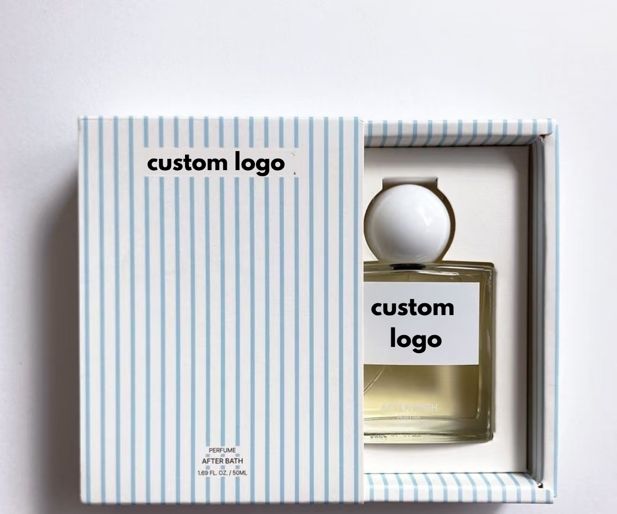
Tip 5:Wrap It Like a Gift—Even if It’s for Yourself
Here’s a secret: people love packaging that feels like a present—even when they bought it for themselves.
Teabox does this beautifully. Their products arrive in exquisitely illustrated boxes, housing gourmet Indian tea in sleek glass vials. It’s classy. It’s ritualistic. It says, “This is no ordinary chamomile.”
Try this if: You want your packaging to create a little ceremony around your product.
Tip 6:Simple, Smart, Sustainable (And Still Stylish)
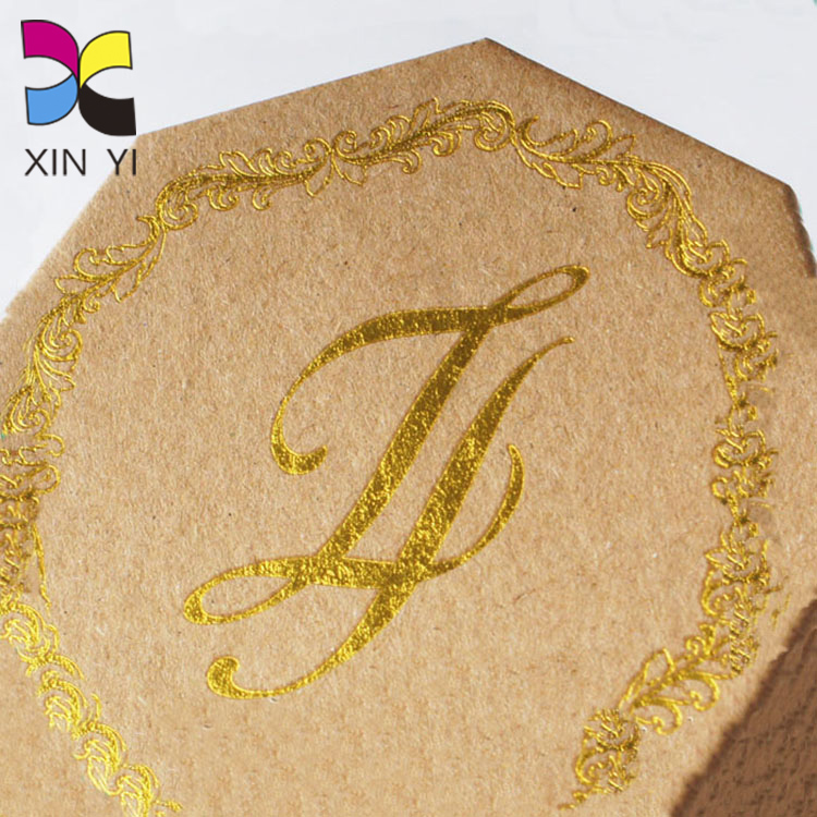
Minimalism: it’s not just for Scandinavian furniture. Brands like Slopes & Town take the less-is-more approach with kraft paper packaging, recycled materials, and just the right amount of design finesse.
It’s eco-friendly, budget-friendly, and—when done right—can be incredibly chic. Think “natural elegance,” not “I forgot to finish this.”
Try this if: Sustainability is your thing, or your brand voice leans cool and understated.
Tip 7:One Bold Color = All the Attention
Not every box needs a rainbow. Sometimes, one bold color can do all the heavy lifting.
Kong Box ships dog toys in all-red packaging—and it works. The red pops on social media, reinforces brand identity, and makes the box instantly recognizable from across the dog park.
Try this if: You want high impact without visual clutter.
Tip 8:Dress It Up with a Sleeve (Because Boxes Like Outfits Too)
Packaging sleeves are the perfect mix of style and practicality. Think of them as an outfit change for your box—same base, new look.
Mother E Essential Oils uses standard boxes, but wraps them in beautiful printed sleeves with different nature scenes to reflect each oil blend. Need to switch it up for the holidays? Just swap the sleeve. Easy.
Try this if: You want variety without redesigning the whole box.
Tip 9:Let Fonts Do the Talking (Loudly or Softly, Your Choice)
Fonts can say a lot about you. Sophisticated. Playful. Retro. Dead serious. Choose right, and your packaging instantly gets more character—without adding a single image.
Skoff Pies uses a mix of nostalgic, homey fonts to give their boxes a cozy, retro diner feel. It’s warm and welcoming. And it tells you exactly what kind of pie experience you’re in for.
Try this if: You want to inject character into your design without overcomplicating it.
Tip 10:Let the Product Shine—Front and Center
A high-quality product photo can do wonders—especially if your product is photogenic (we’re looking at you, gourmet meals and tech gadgets).
Anovo includes photos of their food and their precision cooker on the box—but keeps it clean with lots of white space. The result is appetizing, not overwhelming.
Try this if: Your product looks good enough to sell itself.
What can We Think from Cardboard Boxes?
There you have it—10 ways to elevate your packaging from forgettable to fabulous. Whether you’re going for bold graphics, playful shapes, or just a really well-placed sticker, the right design can turn a simple box into a brand experience your customers won’t forget. So go ahead, mix it up, try something new, and don’t be afraid to have a little fun with it. Because at the end of the day, your box isn’t just holding a product—it’s holding your brand’s first impression. Make it count.