As a global custom box printing manufacturer, we often receive artwork from beginners in RGB mode, which inevitably leads to color-matching challenges during production. It’s important to understand that RGB colors are created by light emitted from digital screens, while CMYK colors are produced by ink reflected on physical materials. Many vibrant tones visible on screen simply cannot be reproduced in CMYK. Therefore, if your goal is to ensure that the final printed packaging box matches the design accurately, your artwork must be created in CMYK from the very beginning.
In professional packaging printing, color management becomes even more critical. When CMYK cannot achieve certain effects—such as metallic finishes, fluorescent colors, or brand colors that require absolute precision without any deviation—a dedicated spot color (Pantone) is required to guarantee consistency and accuracy.
In this guide, we break down CMYK and Pantone in a clear, professional, and practical way to help you make informed decisions for your next packaging project.

What is CMYK?
CMYK (Cyan, Magenta, Yellow, and Black)is a color model created by layering four inks on white paper at different percentages to reflect light and form visible colors. In theory, when cyan, magenta, and yellow inks are printed, each ink subtracts its complementary color of light. For example, cyan ink absorbs red light and reflects green and blue light, which is why we perceive it as cyan.
The more these three inks overlap, the darker the result becomes. When cyan, magenta, and yellow all reach 100%, they theoretically produce black. However, to reduce cost and improve printing efficiency, the black (K) ink is added instead of relying solely on the three-color mixture.
CMYK is the most widely used and fundamental color system in packaging printing today. For first-time printing projects or custom packaging boxes with limited budgets, CMYK is often the preferred and most practical choice.
What is Pantone?
Pantone colors are essentially synonymous with spot color printing. Unlike CMYK, which mixes inks during the printing process, Pantone colors are pre-mixed inks created using precise formulas to achieve a specific, standardized shade. A classic example is the iconic red used by Coca-Cola—printed using a dedicated spot color rather than CMYK.
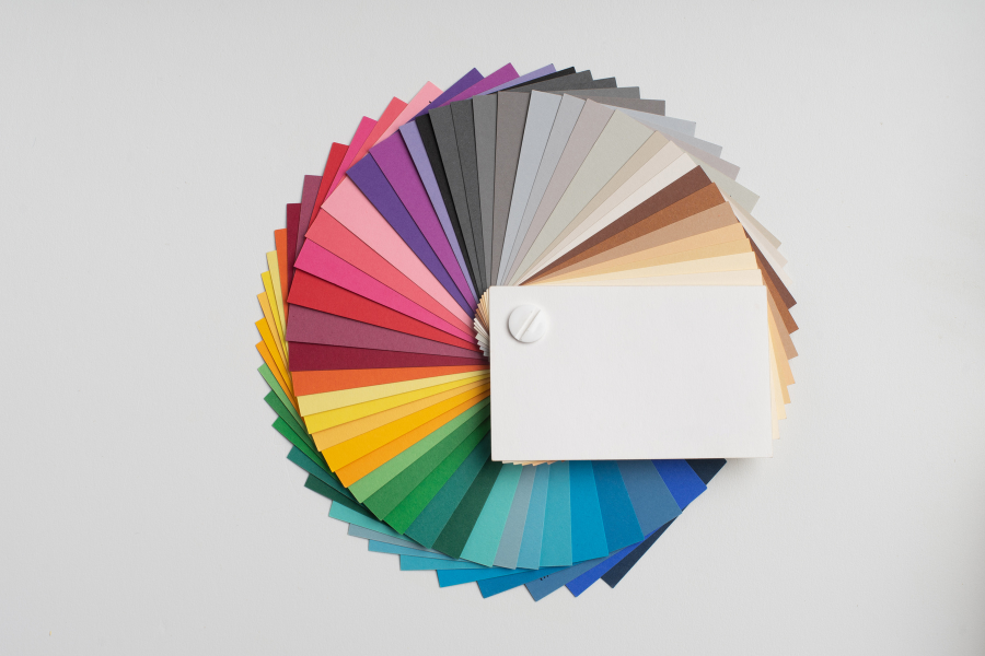
Pantone is the most authoritative color system in the printing industry. The Pantone company has standardized thousands of colors and assigned each one a unique code, allowing brands and manufacturers around the world to achieve consistent and reliable color reproduction. Spot colors offer superior accuracy and vibrancy, making them ideal for brand-critical applications. However, they generally come at a higher cost than conventional four-color CMYK printing.
When your design requires absolute color precision, special effects, or contains very few colors, Pantone spot colors are often the best choice to ensure flawless results.
CMYK vs Pantone: Which Should You Choose for Your Custom Boxes?
| Feature | CMYK (Printing Color) | Pantone / Spot Color |
|---|---|---|
| Color Principle | Subtractive (ink absorbs light) | Pre-mixed ink formulas |
| Main Use | Full-color printing (brochures, posters, packaging) | Brand colors, special effects, single/dual-color printing |
| How Colors Are Created | Mixing cyan, magenta, yellow, and black inks | Using specifically formulated spot inks such as Pantone |
| Color Gamut Range | Narrower (cannot reproduce many vibrant RGB-like colors) | Broader in specific areas (can print colors CMYK cannot achieve) |
| How White Is Produced | Paper white (0% ink) | Paper white (no ink coverage) |
| How Black Is Produced | Four inks combined (e.g., C:75 M:68 Y:67 K:90) | 100% black spot ink (Pantone Black) |
| Key Advantages | Cost-efficient and ideal for multi-color designs | Extremely accurate, vivid, and consistent solid colors |
When selecting between CMYK and Pantone for your custom packaging boxes, the right choice depends largely on your brand priorities, budget, and project requirements.
1. For Absolute Brand Consistency
If your brand color is mission-critical and must remain identical across all markets—similar to how Tiffany & Co. protects its iconic blue—Pantone spot colors offer unmatched precision. Because spot colors are pre-mixed, they reproduce the exact same shade in every printing batch, ensuring flawless consistency worldwide.
2. For Balancing Cost and Visual Results
While Pantone delivers superior accuracy, it also increases production costs because each spot color requires a separate ink and printing plate. For most packaging projects, well-calibrated CMYK printing can still achieve excellent results without significantly impacting the budget. CMYK remains the practical choice for multi-color, complex, or cost-sensitive designs.
3. Always Communicate With Your Printer Early
Regardless of the color system you choose, early communication with your packaging manufacturer is essential. A professional printing team can evaluate your artwork, brand objectives, and material selection to recommend the most suitable printing method—ensuring your final packaging looks exactly as intended.
Key Considerations When Choosing Colors for Custom Packaging Boxes
When choosing and preparing colors for your custom packaging boxes, there are several important technical details to keep in mind to ensure accurate and consistent printing results.
1. Set Black Text as Pure Black (K100) Instead of Rich Black
For packaging and commercial printing, black text should always be set as single black (K100). Pure black produces crisp, sharp edges, making small text easier to read. Using rich black (CMYK combined) can cause minor registration misalignment during printing. While this won’t drastically affect appearance, it often leads to softer, blurrier text—something you want to avoid in professional packaging.
2. Do Not Compare Printed Colors With Your Screen Display
Printed colors should never be judged against what you see on a monitor. Bulk printing follows strict CMYK ink values, whereas screens display RGB light, which is typically brighter. Even when working in CMYK mode, differences in screen calibration will lead to inconsistent color perception. Always request a physical color proof or sample from your printing supplier—that is the only reliable method to confirm the final color outcome.
3. Use Pantone Spot Colors for Special Cases
If your brand color falls outside the CMYK gamut—such as ultra-bright neon shades, metallic effects, or highly saturated tones—a Pantone spot color is required. Specifying a Pantone code ensures exact accuracy and consistent results across all prints. While this option increases production cost, it guarantees the precise brand color and special finish that CMYK simply cannot achieve.
4.Pantone Colors Are Recommended for Large Solid Areas
For packaging designs that feature large areas of solid color, spot colors (Pantone) are generally the preferred choice. Because spot colors use a pre-mixed ink applied in a single pass, they produce a smooth, uniform, and highly consistent color surface with no streaks, banding, or uneven patches. In contrast, CMYK builds color by combining countless tiny dots of cyan, magenta, yellow, and black. While this works well for images and gradients, it often leads to visible inconsistencies in large solid areas due to dot patterns, pressure variations, or ink distribution issues. As a result, when your design includes broad blocks of color that must appear flawlessly clean and even, spot colors provide a noticeably superior finish.
Whether you need cost-efficient CMYK printing or precise Pantone spot colors, our team will guide you through every detail, from artwork preparation to final production.
Whether you need cost-efficient CMYK printing or precise Pantone spot colors, our team will guide you through every detail, from artwork preparation to final production.
Tell us your project requirements, and let’s create packaging that truly reflects your brand. Contact us today for a free consultation or sample proof. Tell us your project requirements, and let’s create packaging that truly reflects your brand. Contact us today for a free consultation or sample proof.


